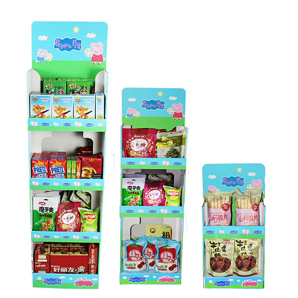
How to match the colors of corrugated cardboard display stand
We must understand the ultimate goal of corrugated paper display stand: to make possible sales faster. The fastest and most direct way for consumers to come into contact with the display style of a store is to see through their eyes. The information that can be obtained visually is the fastest and most complex. How to capture the consumer’s attention in a quick glance?
We use corrugated display stand to use display techniques for stores and products to achieve a series of effects such as highlighting the display, beautifying the shopping environment, stimulating the senses of consumers, and facilitating purchase.

The final effect of the corrugated paper display stand is to make the store a unified style, so the appearance design of the display stand starts from the color selection. We need to pay attention to the three aspects of color hue, brightness and purity. Hue refers to the appearance and name of the color,
In the paper display rack industry, seeing cannot be believing, only the real thing is the real truth.
The brightness of a color actually refers to a change of light and shade as a whole, which is like a gradual process from day to night. Among the colors in nature, yellow is the color with the highest brightness. The purity of color is also called saturation. The higher the purity, the brighter the color. The purity and brightness of color usually affect each other.

The color of corrugated cardboard display stand must be eye-catching enough, and consumers’ eyes can spot it in the first time. But this has advantages and disadvantages. Bright colors are easy to attract consumers’ attention, and at the same time, it is easy to conceal the brilliance of the product.
We are a professional manufacturer specializing in designing and creating cardboard POP displays, including floor displays. If you have any questions, you want to consult or purchase needs, you can contact us.


